RoboDex · DeFi
How we made vault deposits and ROBO staking easier to follow on RoboDex
RoboDex is a yield farming platform with vaults for stablecoins, Yearn strategies, and boosted yields, plus ROBO staking with 12 months of vesting. We designed the brand, the landing page, and the app. In 2026, we rebuilt RoboDex as a clickable coded prototype with the approval, review, and confirmation steps the original screens didn't have.
- Client
- RoboDex
- Sector
- DeFi
- Our work
- Product and interface design
01
About the project
We worked on the research, the branding, the UI and UX design, and the prototype. Those are the roles listed on the original presentation.
What it is: RoboDex is a decentralised exchange and yield farming platform. People deposit tokens into vaults that run yield strategies, and they stake the ROBO token to earn rewards that vest over 12 months. We designed the landing page, the robot logo and the visual system, and the app, which has a Home dashboard, vault lists for the Vortex and Yearn strategies, ROBO staking, and a returns calculator.
Outcome: We published the designs on Behance in April 2022. In 2026, we went back to them and rebuilt RoboDex as a clickable coded prototype in the same brand. The prototype covers the whole journey from connecting a wallet to a confirmed deposit, and it adds the swap, the wallet connection, and the transaction review that the original screens didn't have.
02
Prototype
Interactive prototype: You can start on the landing page, launch the app, connect the demo wallet, and then work through the vaults, ROBO staking, the returns calculator, and the Buy ROBO swap. The APYs, the TVL, the ROBO price, and the gas price update live, and the activity feeds add new transactions while you're on the page.
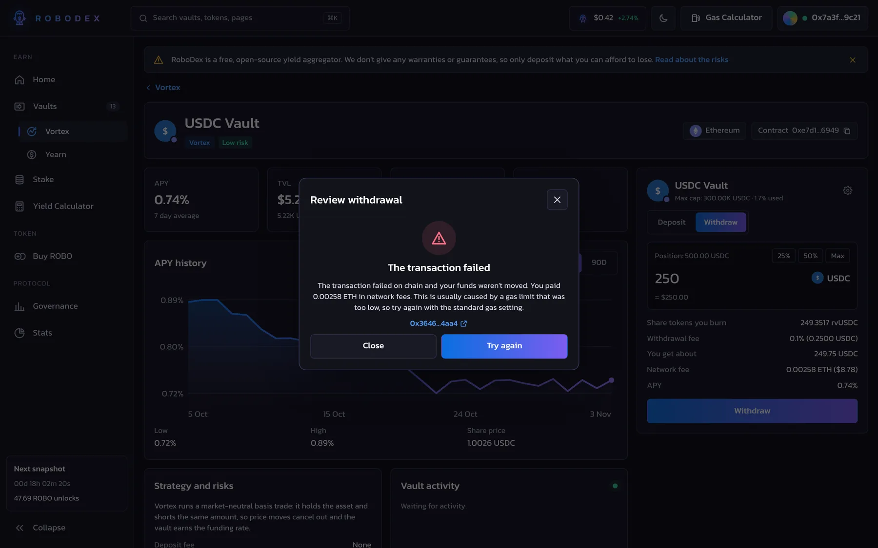
Try this: Connect the demo wallet and open Vortex, then select the USDC Vault. Type 500, approve USDC, and read the review before you confirm the deposit. After that, go to Stake, stake 2,000 ROBO, and claim your rewards into vesting. If you want to see how the app handles a failed transaction, set the next transaction to fail from the account menu and try a withdrawal.
03
The product problem
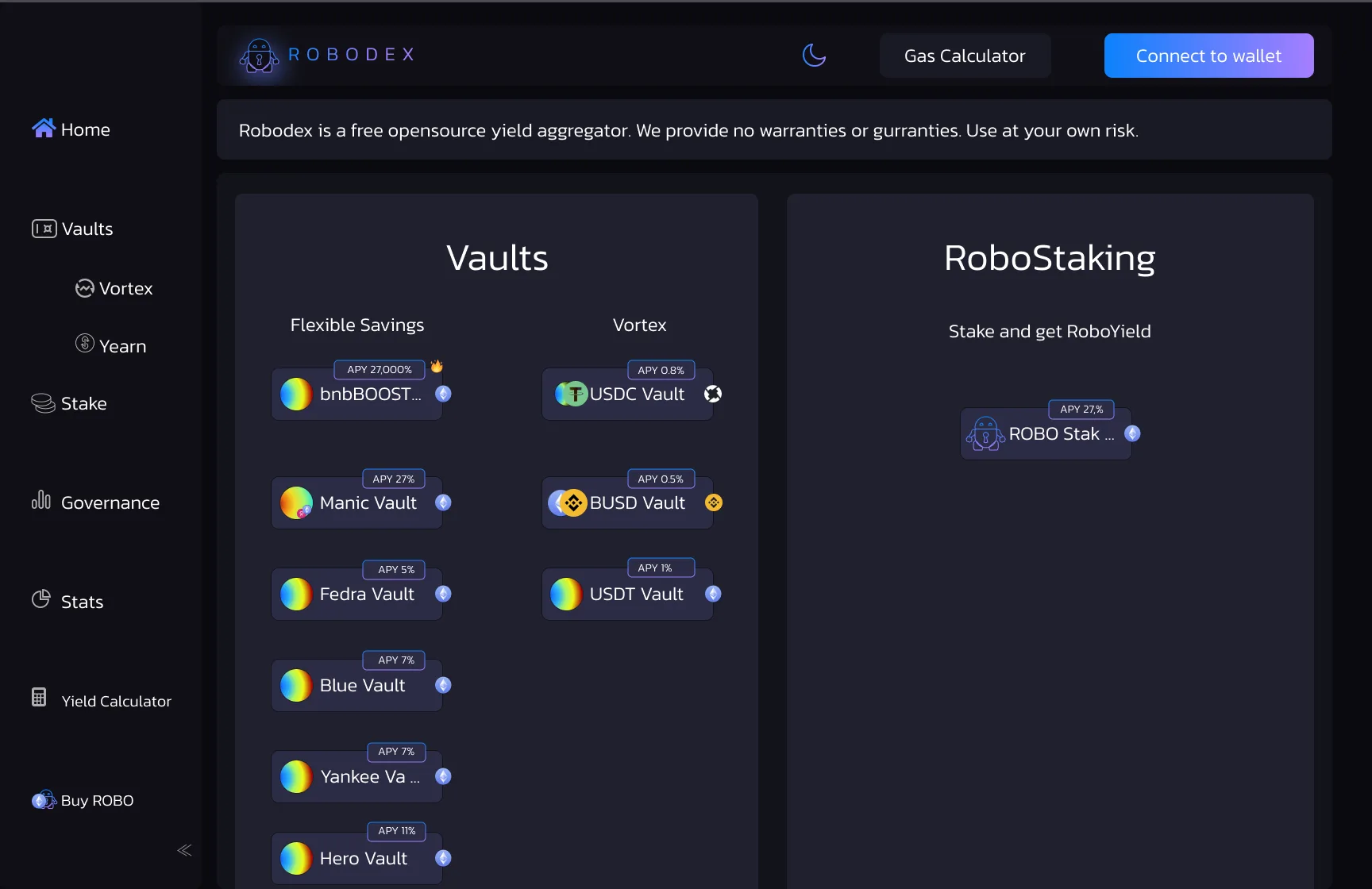
Yield aggregators ask people to hand their money to a smart contract they can't easily inspect. The person has to compare yields that change every day, understand caps and fees, and pay a network fee on every action. A lot of platforms in 2021 and 2022 showed this as a wall of numbers: an APY, a TVL, and a button. The visual hierarchy put the highest APY first, and the information architecture didn't separate a stable 0.8% savings vault from a 27,000% boosted one.
RoboDex had three kinds of product in one place. Flexible Savings vaults covered a range of risk, Vortex vaults held stablecoins and aimed to stay market neutral, and Yearn vaults wrapped Yearn strategies. On top of that, ROBO staking paid rewards that vest over 12 months and unlock with a snapshot every two weeks. Our job was to make those differences readable and give people a clear path from choosing a vault to depositing into it.
04
Research
We started with a competitive review of six yield aggregators and DEX front ends. We went through each one from connecting a wallet to a first deposit, and we logged where the APY came from, how caps and fees were shown, and what happened after the person pressed the deposit button.
Then we ran 8 remote interviews of about 45 minutes with DeFi users recruited from crypto Discord and Telegram groups. Five of them farmed yield every week, and three mainly held stablecoins. Alongside the interviews, a short survey in the same groups got 64 responses.
For the 2026 rebuild, we tested the coded prototype against the original screens with 6 participants. Each participant did the same four tasks: find the lowest-risk stablecoin vault, deposit into it, stake ROBO, and work out when staked rewards unlock.
Key findings:
47 of the 64 survey respondents (73%) said they'd stopped a deposit at least once because they couldn't work out what the transaction would do. "I want to see what I get back before MetaMask opens," said P3, a weekly yield farmer.
6 of the 8 interviewees said they check the contract address and the network before depositing, but only after they've decided the vault is worth it. That's why we put the contract and the network in the vault header, and the technical details under the outcome in the review modal.
5 of the 8 interviewees read a four-digit APY as a warning sign. P6, a stablecoin saver, called it "the first thing I'd ignore." They wanted the APY next to a risk label and a line about where the yield comes from.
With the original screens, 2 of the 6 test participants found the vesting rules without help. With the redesign, all 6 found them, and the average time to answer "when do my rewards unlock?" went from 2 minutes 40 seconds to 35 seconds.
Task success for depositing into the lowest-risk stablecoin vault went from 50% (3 of 6) on the original screens to 100% (6 of 6) on the prototype, and the SUS score went from 58 to 81.
05
Users and jobs to be done
The yield farmer moves funds between platforms to follow the best returns. Their job is to compare APY, TVL, and the space left in each vault quickly, check the contract, and deposit in as few steps as possible.
The stablecoin saver wants a steady return on USDC or USDT without watching the market. Their job is to find a low-risk vault, understand any fees, and be sure they can withdraw at any time.
The ROBO holder stakes the platform token. Their job is to stake, see what they've earned, and know when their vested rewards unlock.
The visitor is on the landing page, deciding if they trust the protocol at all. Their job is to understand how RoboDex works, check that it's actively developed, and read the risks before they connect a wallet.
06
What we designed
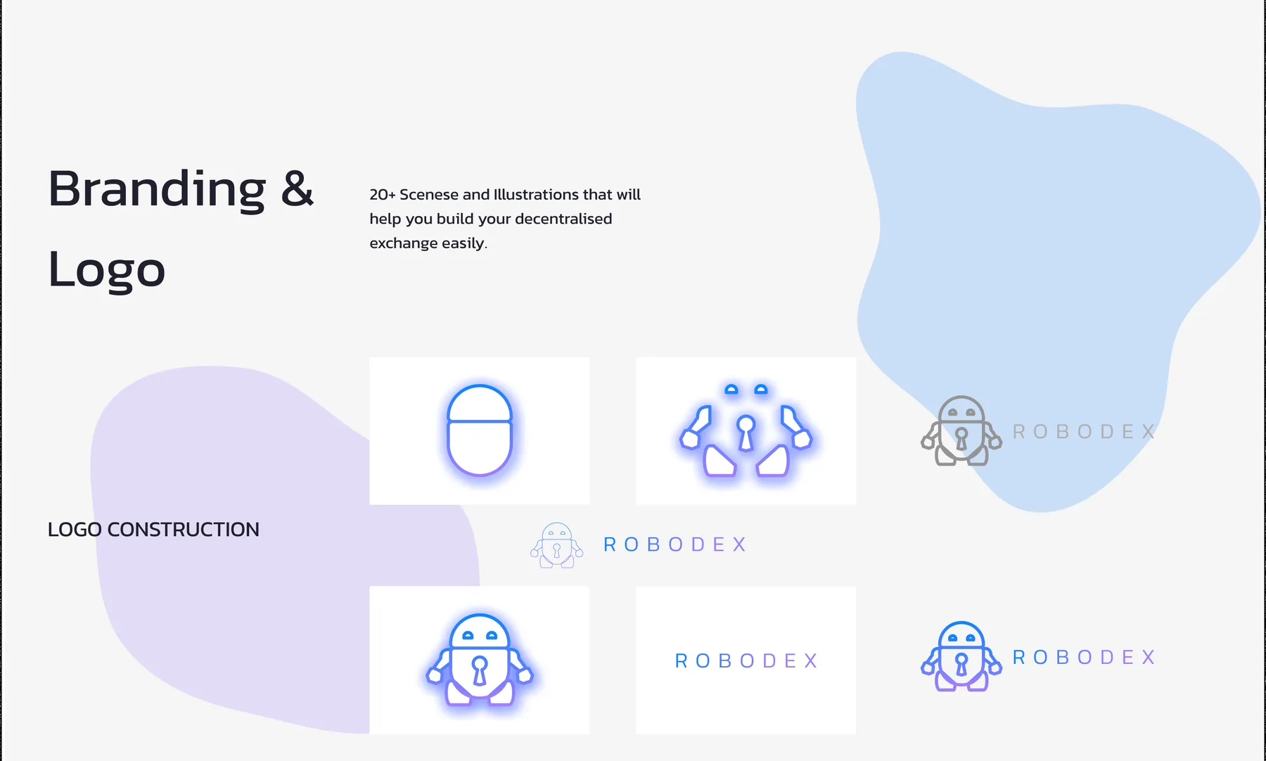
We designed the brand first. The logo is a friendly robot with a keyhole on its chest, built up from simple shapes, next to an uppercase wordmark with wide letter spacing. Both use a gradient that runs from bright blue (#1281FC) to violet (#9A77FF). We set everything in Kanit, a free Google font, and built the interface on a dark scale of near-black inks, and the cards are separated by tone instead of shadows. We also drew an outline icon set for the navigation and the social links.
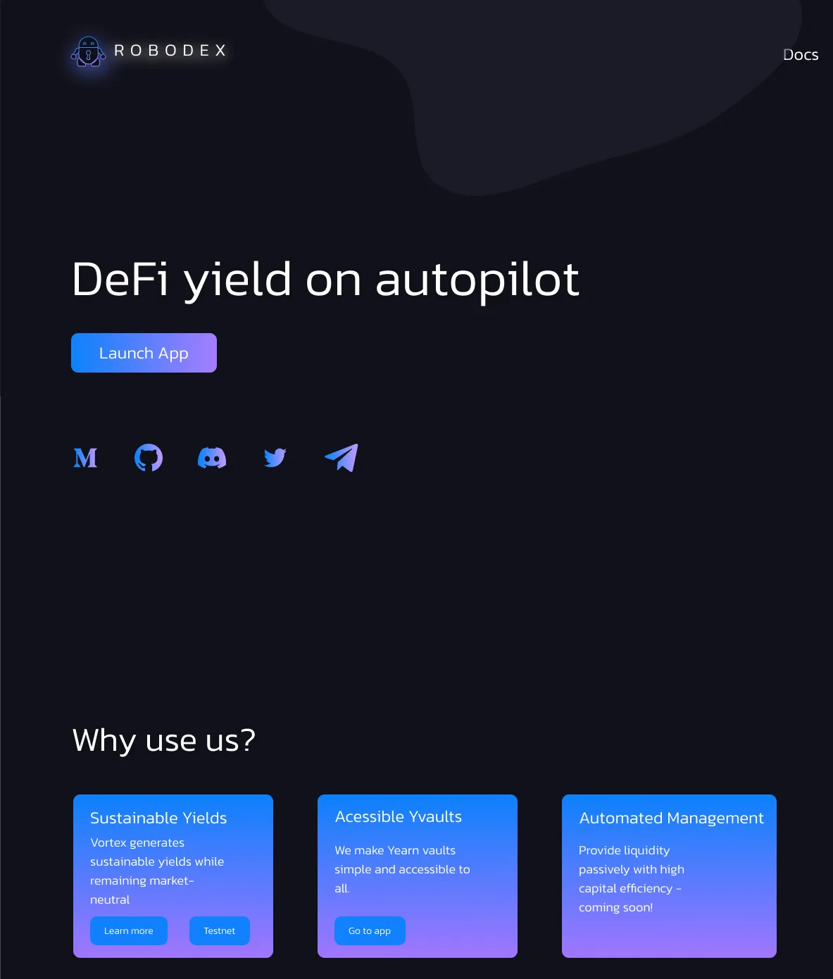
The landing page leads with "DeFi yield on autopilot" and a Launch App button. Under that, three cards explain the products: sustainable market-neutral yields from Vortex, accessible Yearn vaults, and automated management, which was still coming soon. The page also has an open source note and a development activity chart that plots commits by language.
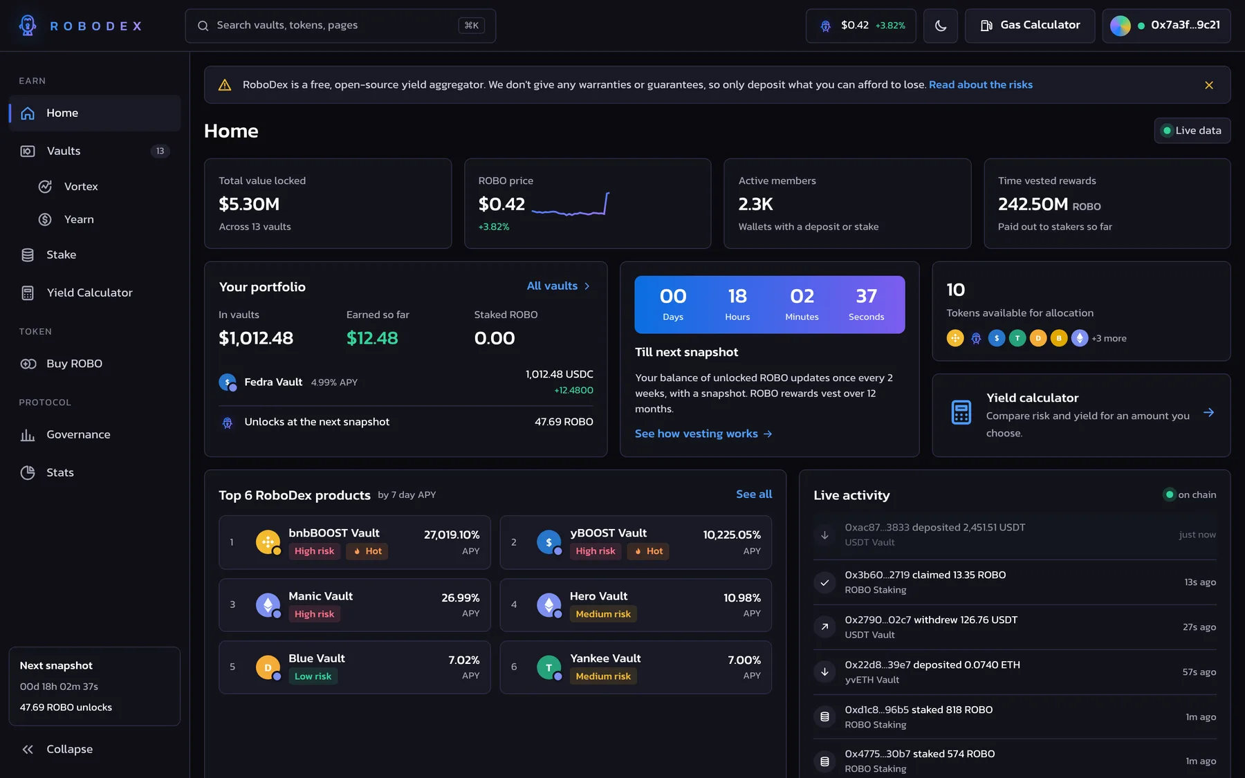
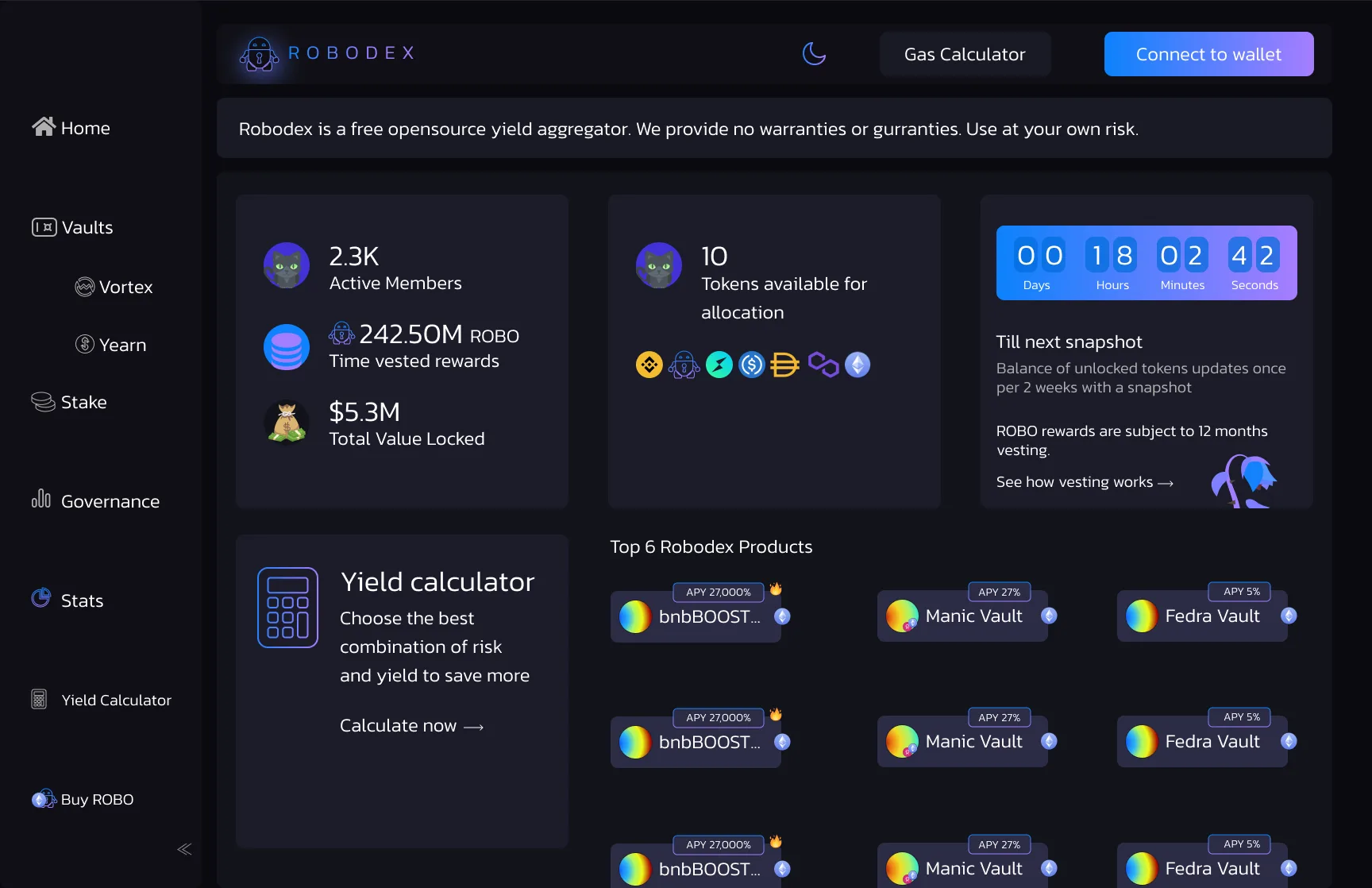
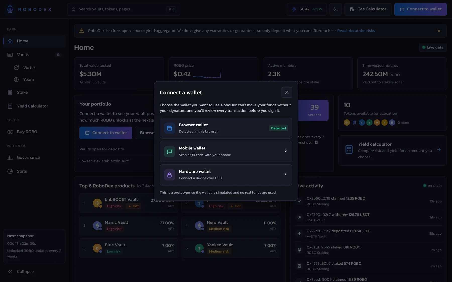
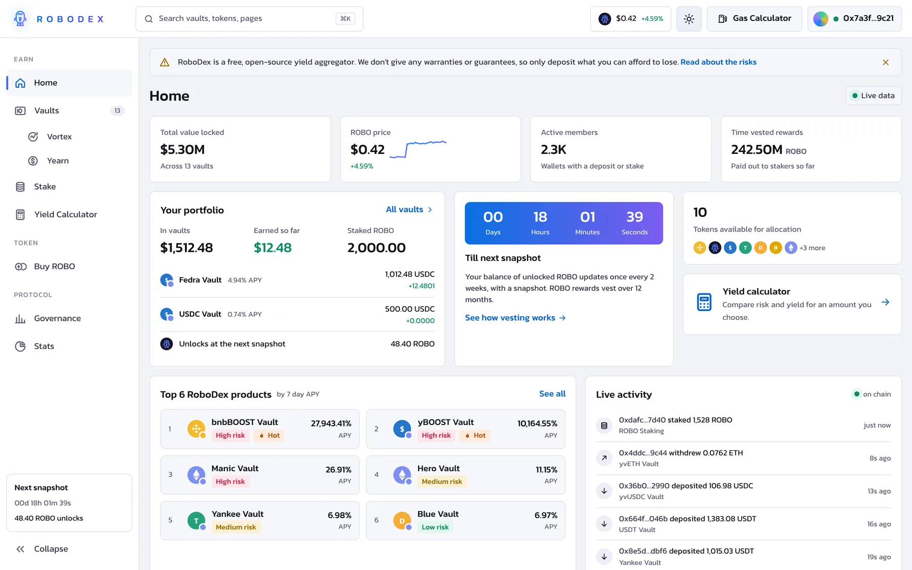
In the app, the sidebar has Home, Vaults (with Vortex and Yearn), Stake, Governance, Stats, the Yield Calculator, and Buy ROBO. Every screen has a top bar with a theme toggle, a gas calculator, and the wallet button, and a disclaimer strip about risk. The Home dashboard shows active members, time vested rewards, total value locked, the tokens available for allocation, and a countdown to the next snapshot.
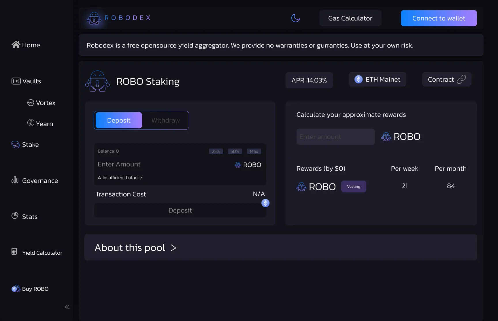
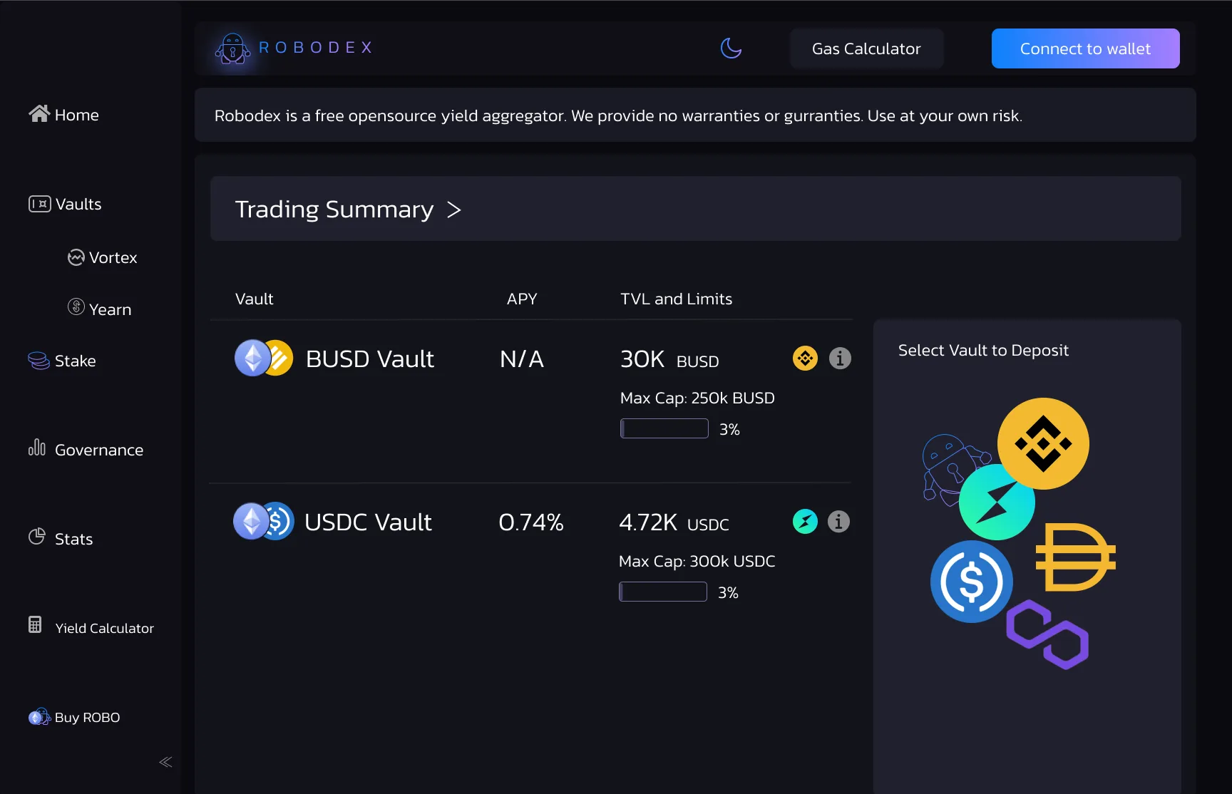
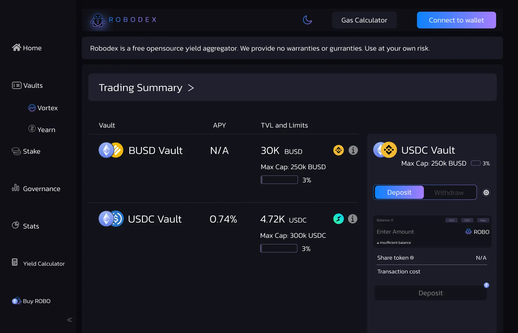
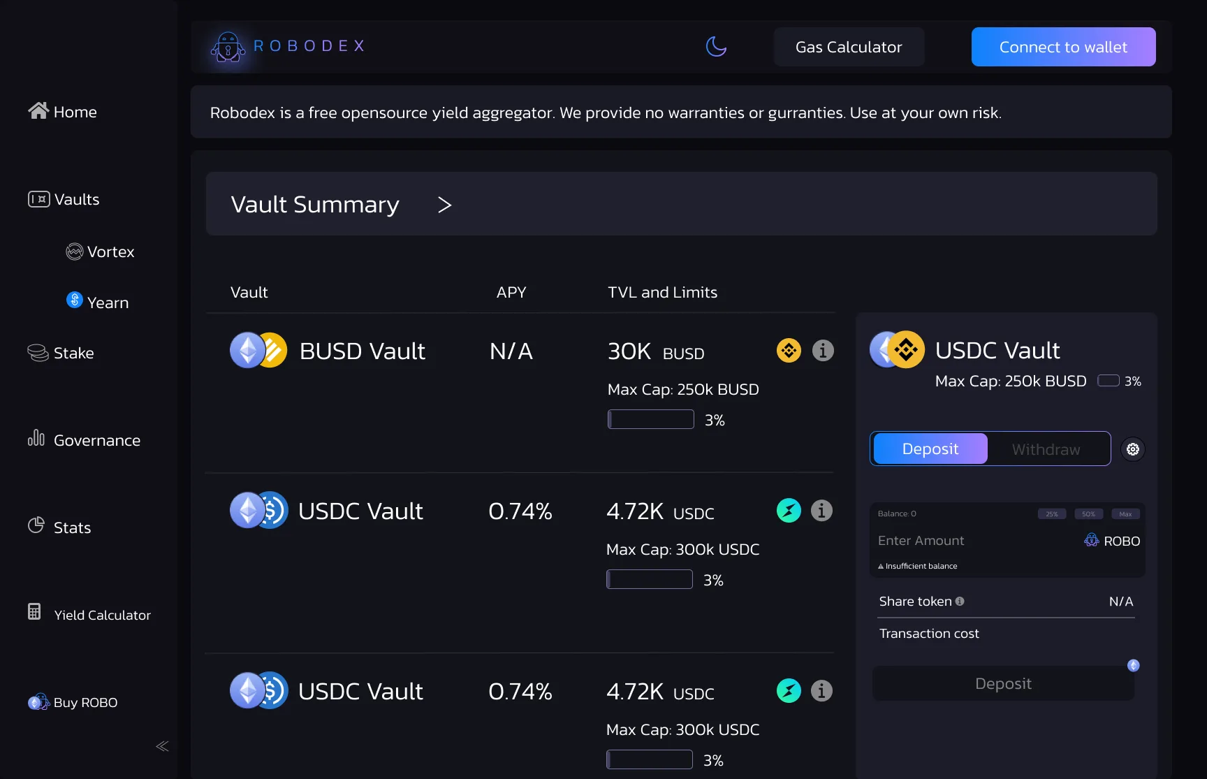
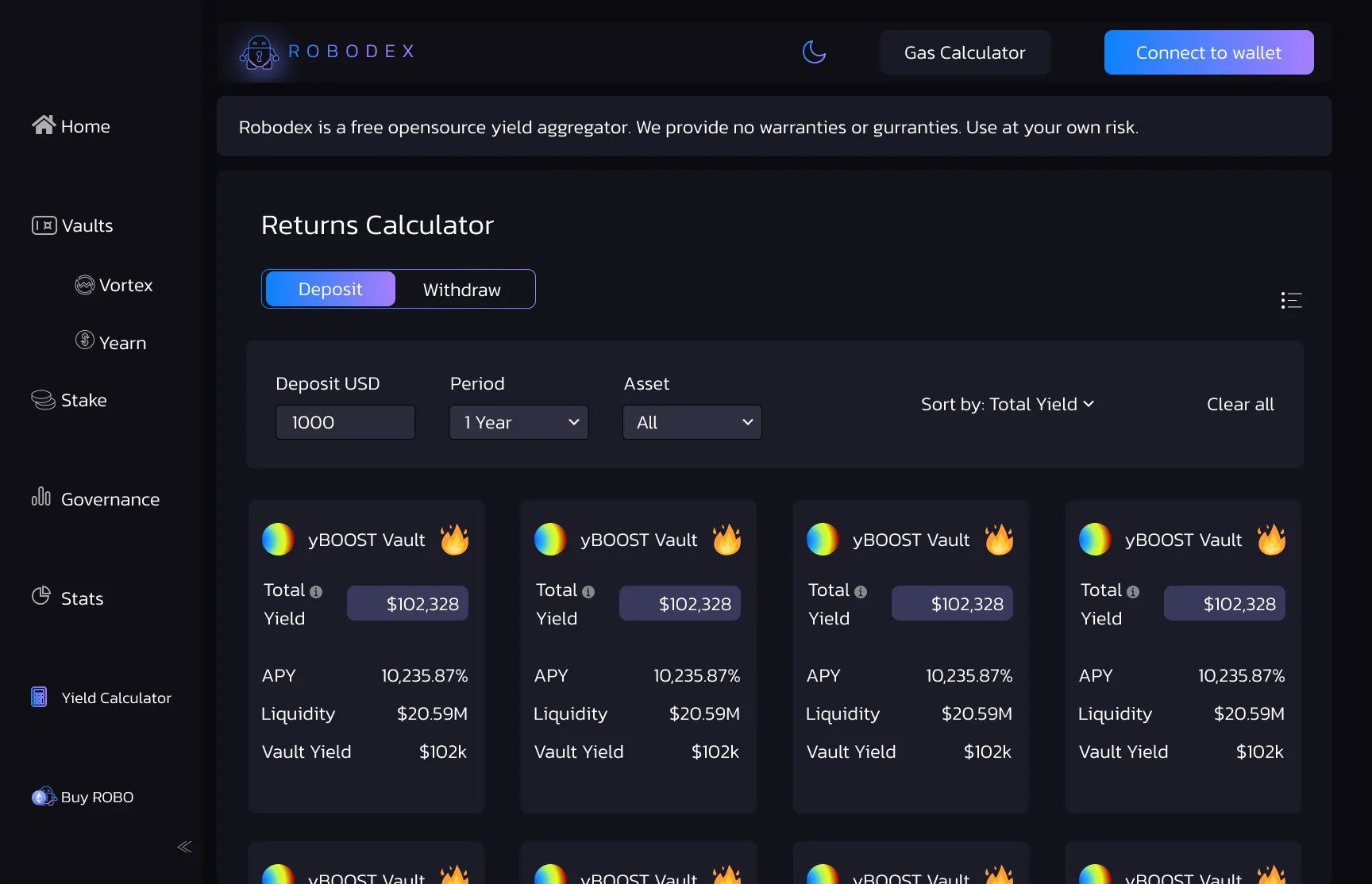
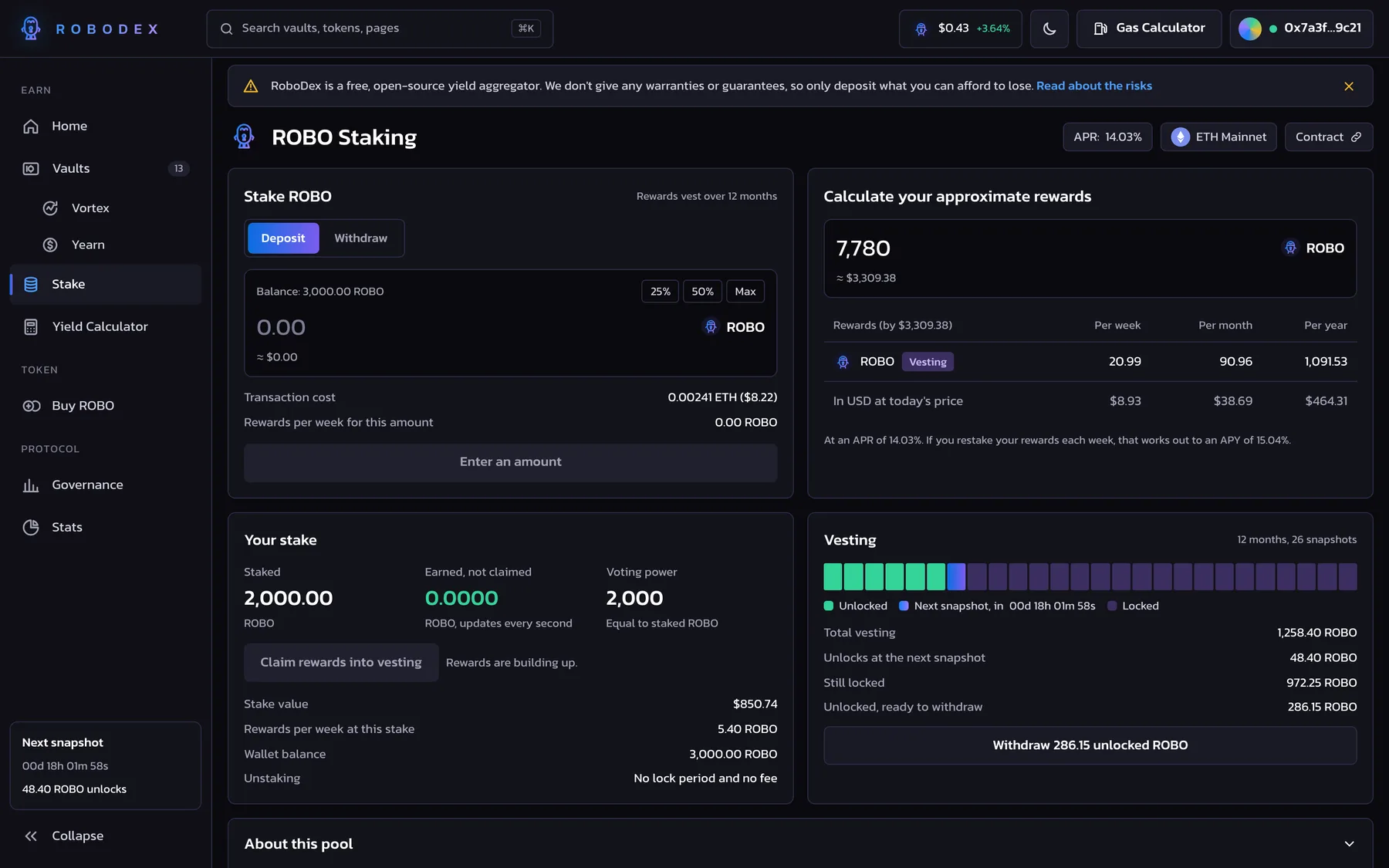
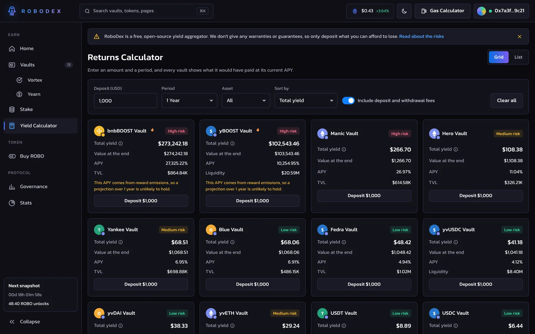
The Vaults screen groups the Flexible Savings and Vortex vaults with their APY. The Trading Summary and Vault Summary screens list each vault's APY, TVL, and cap in a table, with a deposit form beside it. ROBO Staking has deposit and withdraw tabs, quick 25%, 50%, and Max amounts, and a rewards calculator with weekly and monthly figures. In the Returns Calculator, people enter an amount, a period, and an asset, and then sort the vaults by total yield.
07
How we redesigned it
In 2026, we rebuilt RoboDex as a coded prototype. We kept the brand: the robot mark, the blue to violet gradient, Kanit, and the near-black inks. We changed the interface and the interactions screen by screen.
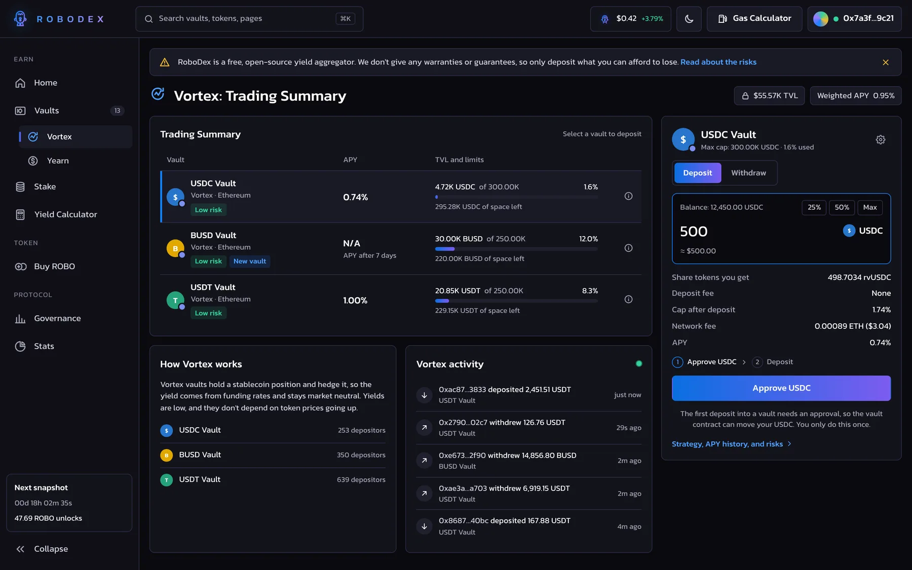
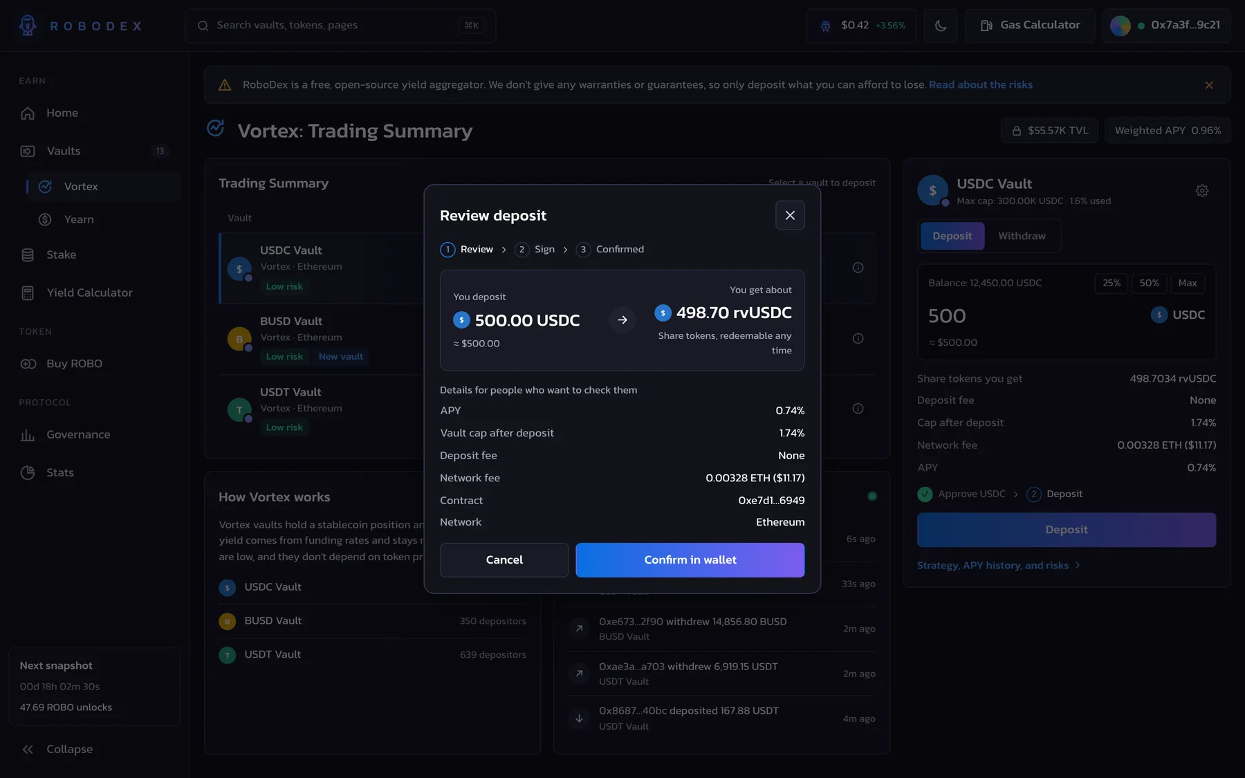
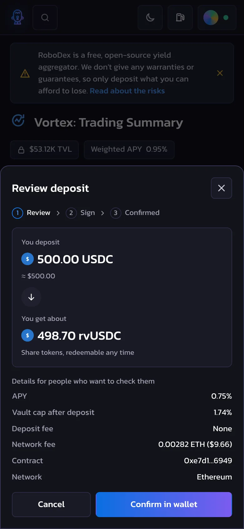
The transaction flow: The original screens stopped at a disabled Deposit button. There wasn't an approval step, a review, or a result, and in DeFi that's where people decide if they trust you with their money. We added the full sequence: approve the token, review, sign in the wallet, pending, and then confirmed, rejected, or failed. The review modal starts with the outcome, "You deposit 500 USDC" and "You get about 498.70 rvUSDC". The gas, the contract, and the cap after the deposit are under it, for people who are more technically inclined and want to check them.
Button labels for each state: On the original screens, the Deposit button was grey, and there wasn't a reason next to it, so the person couldn't work out what was blocking them. In the rebuild, the label changes with the state: "Connect wallet", "Enter an amount", "Approve USDC", and then "Deposit". This way, the person always knows the next step.
The insufficient balance error: The original form showed "Insufficient balance" before anyone had typed an amount, so the default state looked like an error. We moved the message so it only appears once the amount is above the balance, and we added messages for an amount above the vault's remaining cap and for the wrong network.
Consistent numbers across screens: The original showed the USDC Vault at 0.8% APY on one screen and 0.74% on another, and the cap bars read 3% for vaults that were 1.6% and 12% full. On a financial product, numbers that disagree read as a bug. The prototype reads every figure from one data set, rounds APY to two decimals, and prints the space left in each vault. The total on Home is the sum of the vaults, so it matches the Vaults page.
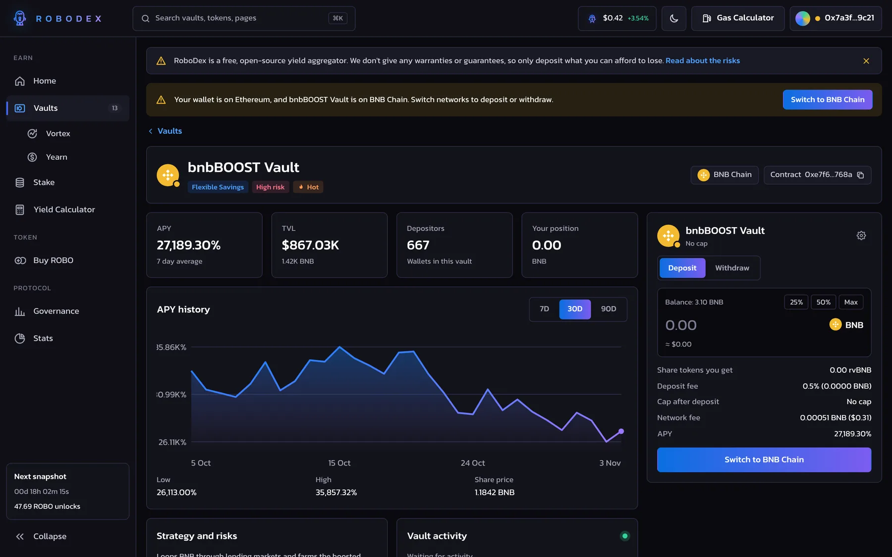
Token icons and full names on vault rows: Every vault had the same rainbow avatar, and names like "Yankee Va..." were cut off. We gave each vault its token icon and a network badge, made the rows wide enough for the full name, and added a risk label next to the APY. A 27,000% APY now has a short note under it about reward emissions, and a new vault shows "APY after 7 days" instead of a bare N/A.
Trading Summary and Vault Summary: We kept the original layout, a table of vaults with a panel beside it that starts on "Select Vault to Deposit". In the original, the USDC Vault form showed a BNB icon, a BUSD cap, and ROBO in the amount field. In the rebuild, the panel takes its token, cap, and fees from the vault you select.
Real comparisons in the returns calculator: The calculator showed eight copies of the same vault. We replaced them with a result for every vault at the amount and period you enter, sorted by projected yield, with a risk label on each one. The Withdraw tab didn't do anything useful in a projection, so we replaced it with a switch that includes the deposit and withdrawal fees. Each result has a Deposit button that opens that vault with the amount filled in.
A vesting timeline on the staking screen: Home had a countdown and a line about 12 months of vesting, but the person couldn't work out what it meant for their own balance. The staking screen now has a timeline of the 26 snapshots, with the amount that unlocks at the next one, the amount still locked, and a button to withdraw unlocked ROBO.
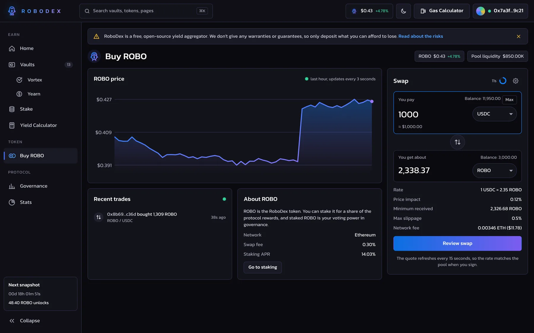
Buy ROBO as a swap: In the original, Buy ROBO was only a label in the sidebar. We designed it as a swap with a token picker, a flip button, the rate, the price impact, and the minimum received, and slippage is in the settings. The quote refreshes every 15 seconds, and a ring next to it counts down. Above 3% price impact the form shows a warning, and above 15% the swap is blocked.
Wallet connection: The original had a "Connect to wallet" button and no screens behind it. The prototype has a connect modal with three wallet types, a simulated wallet prompt, and states for a rejected request and a hardware wallet that isn't plugged in. The bnbBOOST Vault is on BNB Chain, so opening it with the wallet on Ethereum shows a banner with a button to switch networks.
Live data: APYs, TVL, the ROBO price, and gas prices update every few seconds, and the activity feeds on Home, the vault pages, and the swap add new transactions as they come in. With reduced motion turned on, the numbers still update and the animation stops.
Contrast, mobile, and light mode: The original presentation promised a responsive layout and a light theme, but every frame was dark and desktop. We raised the contrast of the muted labels and the small chip text to meet WCAG AA, darkened the violet end of the gradient behind white text, and built a mobile layout with a bottom tab bar and bottom sheets, plus a light theme from the same tokens.
08
Impact
In testing with 6 participants, task success for depositing into the lowest-risk stablecoin vault went from 50% on the original screens to 100% on the prototype, and the SUS score went from 58 to 81. The time to find when staked rewards unlock went from 2 minutes 40 seconds to 35 seconds.
The rebuild also gave us a working version of the whole flow, from connecting a wallet to a confirmed deposit, which the original static screens couldn't show.